MovieMania project

Product Overview
The MovieMania app partners with movie theater chains to provide the best selection of movie trailers available online to promote their current and upcoming movie offerings. The goal is to increase sales, customer engagement, and customer satisfaction. The app focuses on making all of the best trailers available for the film aficionado, and all movie-goers. And of course the app will provide a seamless ticket purchasing interface for our customers.



My Role
Lead UX designer designing the MovieMania app from conception to delivery.
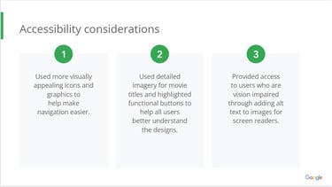
Duties include (but not limited to): Conducting interviews, paper and digital wireframing, low and high-fidelity prototyping, conducting usability studies, accounting for accessibility, and iterating on designs.
The Problem
Movie-goers need a go-to app for viewing movie trailers and purchasing tickets, without having to waste time sifting through movie or cast info that they don't need.
The Goal
Provide an easy to use and easy to navigate movie trailer app that’s intuitive to users’ preferences, and learns what movies and trailers they like over time. This will be done with the assistance of AI technology. The app will be a ‘one-stop shop’ that also provides a user friendly interface for purchasing movie tickets.
User Research
I conducted interviews and created empathy maps to understand the users I’m
designing for and their needs. I asked user questions about what they like and dislike about movie trailer and ticketing apps. Analyzed user data to determine what problems they're having with core tasks: app navigation, movie trailer viewing experience, ticket ordering experience. Used the results from this research study to inform our improvements to the app’s design.
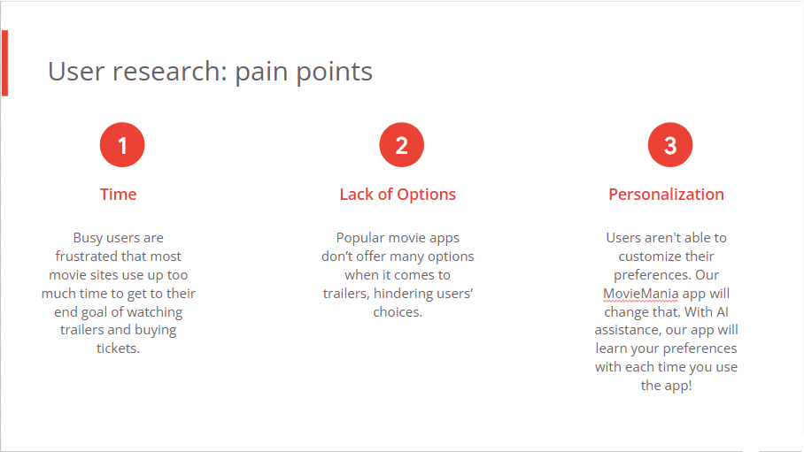
A primary user group was avid movie-goers, who confirmed my assumption that most available apps required too much time to get through unnecessary pages and information before getting to movie trailer and ticket purchase screens. Research also showed that users may not be satisfied with the quality and types of trailers that are available through other apps.


Competitive Audit
I performed a competitive audit on three of MovieMania's competitors in the market: iMDB, Atom Tickets, and AMC Theatres. The purpose was to see how they position themselves in the market, what their apps do well and what they do not do well, and how to apply this information to benefit the MovieMania app.
Some opportunities we identified to distinguish ourselves in the market include:
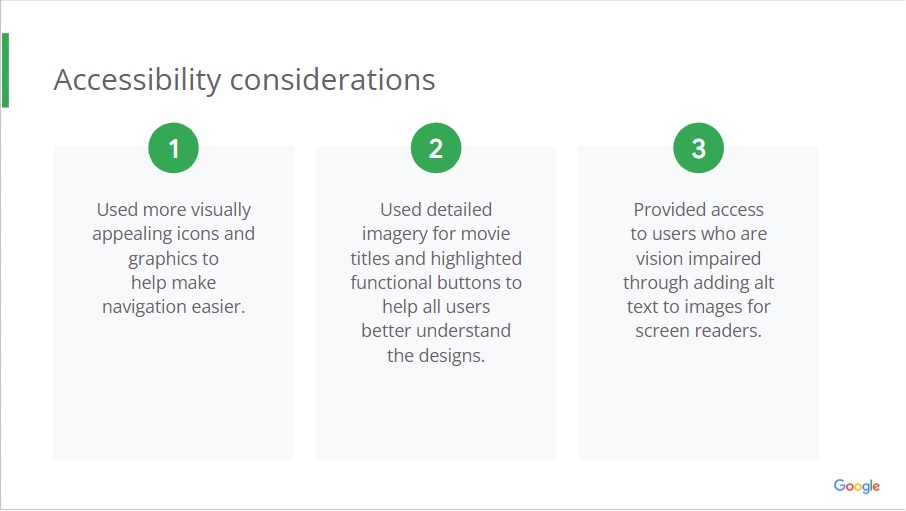
-Address accessibility throughout the app. Include multiple languages for each movie trailer, and each area of the app. Offer screen-reader available technology for the vision-impaired. Offer closed captioning for the hearing-impaired.
-Include all available trailer options of any duration or format. Offer a thorough and user-friendly way for users to search, sort and categorize their trailers.
-Build a smart and intuitive app (perhaps by incorporating Artificial Intelligence) that can learn the users’ preferences and habits over time. This will enable the user to save time and effort when searching and watching their favorite movie trailers.
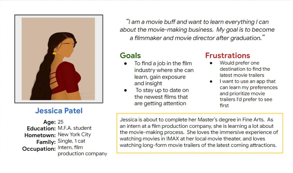
Focus on User Persona: JESSICA
Problem statement:
Jessica is an aspiring filmmaker interning at a film production company. She needs One Easy to use and easy to navigate movie trailer app that’s intuitive to her preferences and what movies she likes. Most apps have too many movies to choose from, and there are too many movie/ entertainment sites.
User Journey Map:
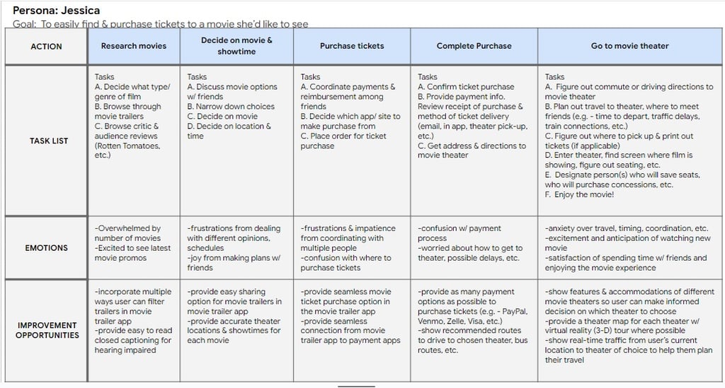
Mapping Jessica’s user journey revealed how helpful it would be for users to have access to the MovieMania app.
Ideation/ Wireframes/ Lo-Fi & Hi-Fi Prototypes
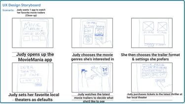
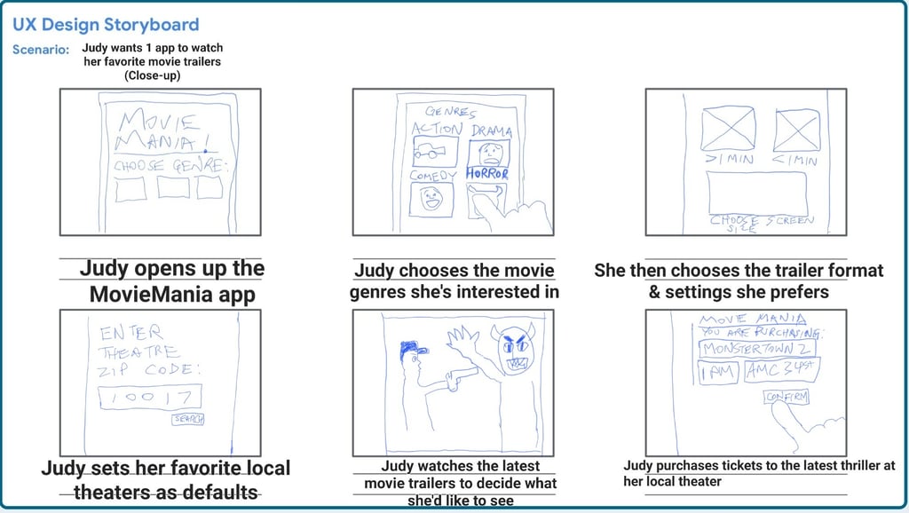
Storyboards and Wireframes were created to work out preliminary ideas for proper user flows. Then low fidelity prototypes were built into high-fidelity prototypes as we get closer to the finalized product.
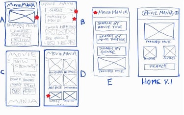
Paper Wireframe:
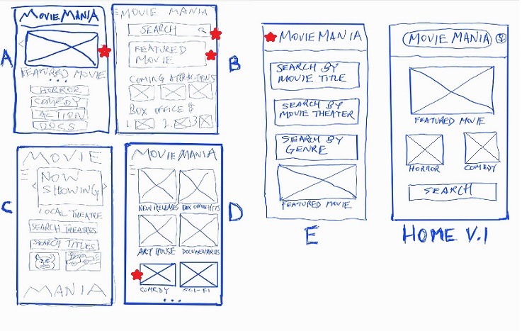
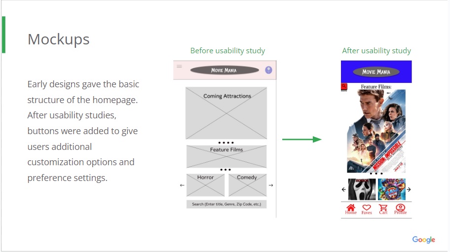
Taking the time to draft iterations of each screen of the app on paper ensured that the elements that made it to digital wireframes would be targeted to address user pain points. For the home screen, I prioritized a quick and simple browse and search process to help users save time finding the right movie.
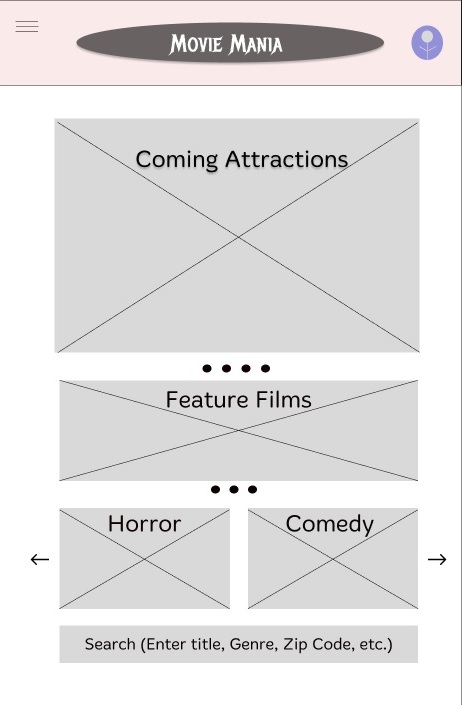
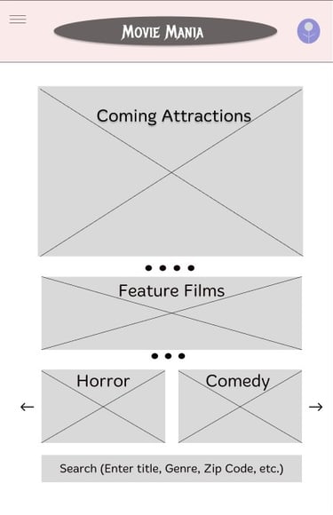
Digital Wireframe:
As the initial design phase continued, I made sure to base screen designs on feedback and findings from the user research. Iterations were based on previously sketched wireframes.
Lo-Fi Prototype:
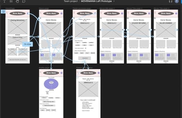
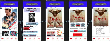
Using the digital wireframes, I created a low-fidelity prototype. The primary user flow I connected was searching and browsing horror movies, and purchasing tickets.


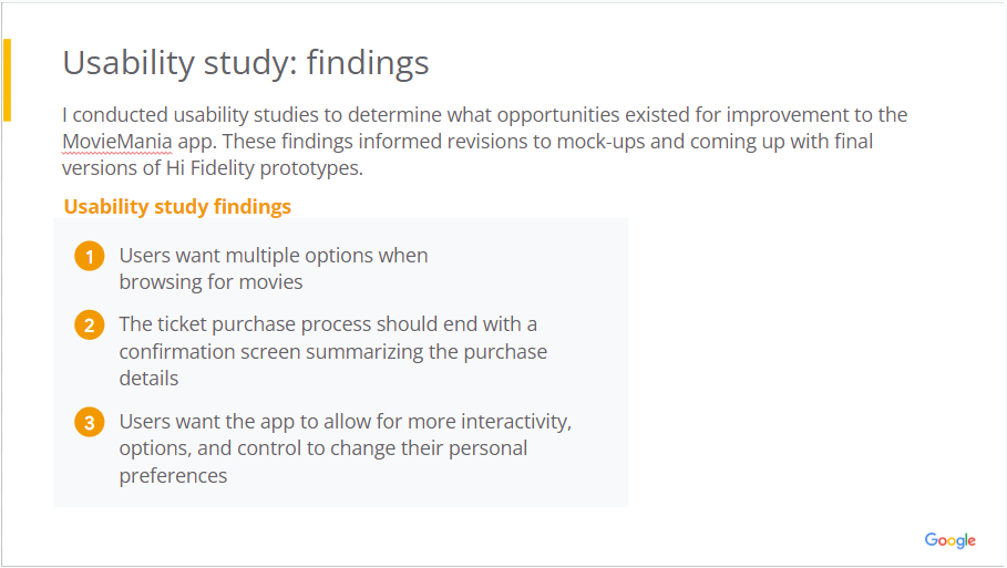


Hi-Fi Prototype:
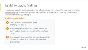
The high-fidelity prototype presented cleaner user flows for browsing for movies, finding a theater, and movie ticket checkout. I incorporated visual elements like images, color, typography, iconography. In this prototype, we honed in on the main user flow for the movie ticket purchase and checkout process.


Final Thoughts:
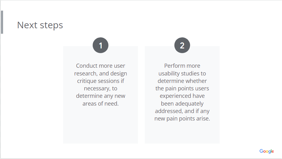
We did it. We built the foundation of a go-to app for viewing movie trailers and purchasing tickets that's efficient, engaging and functional. The user's journey and experience is exactly what needs to be focused on when building and iterating on a new app. Multiple usability studies, gathering peer feedback, accounting for accessibility and equity. However, even after final HiFi prototypes are delivered, changes and improvements may be necessary because user needs can always change or new ones may be discovered.
